In retrospect of this module I feel I have produced some interesting work, displaying my capabilities as a designer in the present and for the future. Juggling four briefs is something that I am use to now and believe it is good practice to organise time, dedicate and sacrifice to complete them in such a manner.
Originally, I set out to put in place 4 briefs with resolutions that would compliment my portfolio and developing work, which represented me when approaching the industry. These were type driven, layout for onscreen and print purposes, to promote and inform causes which were of interest to me, whether it be corporate industries or for a cause that I felt strong about. I feel I have successfully adhered to my aims, by completing a corporate identity (F.E.S.), an interesting solution to a cause I had an opinion on (Anti-organic), Type and Layout on-screen in the form of a website (Assembled) and type and layout in the form of print.
I realise now that my style of design certainly is not intended for graphic designers nor does it try to communicate strongly to others within the industry, but more towards in aid of society and the public, non-designers. In reference to my rational, I set out to be a “useful” designer. This perhaps, is because I’ve always believed that design should have a message and should tell that message in a way that is interesting/ witty or simple to understand. And I think there is more purpose in the world for this type of Graphic Design, to be able to communicate information to those who really need clarity of information.
The weaknesses I would identify from this module would most probably be the posters from the Anti Organic brief as the screen print quality did not come out as well as I would have hoped, as some fine details were lost due to a lack of pressure when running the spot varnish over the screens. In light of that I did enjoy it as it re-ignited my interest for this particular print process and the quality it gives to the work produced. I particularly enjoyed mixing the printing techniques of digital and screen, and can perhaps think of more interesting ways to utilise that in the future.
I also struggled with some of the design for web, as I have never done so previously before with little guidance. I was introduced to the term ‘Pixel Perfect’ by Joe Gilmore, which then complicated the project and made me realise how difficult and precise it was to ready comps for internet production. This project made me wonder whether I needed to become fully competent with Dreamweaver or web-design as it seems unnecessary if my job/ aim is to design layouts and styles for websites, however saying that, I think it would be useful to understand the process of actually producing a functioning website in the future, perhaps in my own time.
My strengths on this course have been down to my notepad/book, which I owe greatly to for keeping me organised and reminding myself to stay on top of things. Without it I don’t think I would have met the deadlines or produced the work that I did. The highlight piece of work has been designing the website, where I got to produce layouts on screen and learnt to think about different constrictions when doing so, as well as being a creative thinker (the dots) a photographer for some of it.
Overall this module has been a valuable lesson for me. I have come closer to recognizing where I fit into within the industry, I have explored designing websites (which I have a keen interest in) and realised that screen-printing is something I should perhaps utilise in the future. This has been useful, as I also have more work to put into my portfolio and can move forward onto the next stage of this course, where I hope to go on and challenge my abilities and explore different areas of Graphic Design.
Thursday, 18 December 2008
Sunday, 14 December 2008
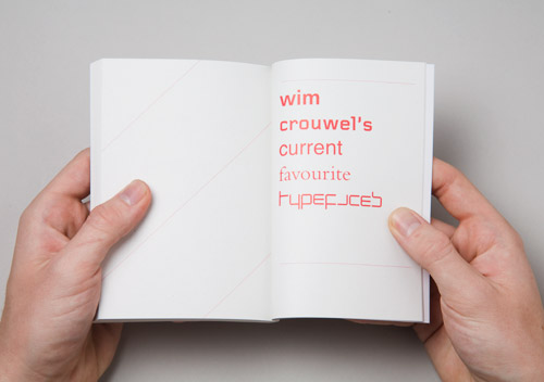
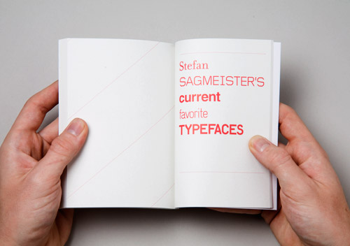
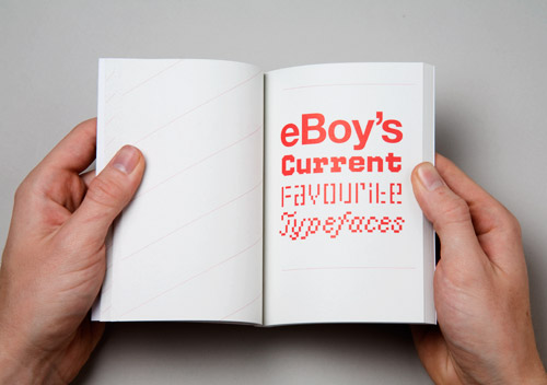
Research & inspiration: 50 Designers Current top 5 Typefaces
This book would be good to get a hand on.


Tuesday, 9 December 2008
Promoting Assembled: Development/ Trials & a quick update

So for this brief I am promoting Assembled in a manner which realistically wouldn't be done if in a way in which if I were to seriously do it. I really want some typographic work, some interesting, visually attractive stuff in my portfolio and so I have embarked on a quest to design some posters promoting Assembled via A1 dimensions.
Up until now, I have worked on a corporate identity, an interesting conceptual solution for a cause and opinion I set myself, and designed a website which have been all fun and interesting. However I don't feel as though I've had time in the playground to try something on my own, to express some inner feelings... if that doesn't sound too pathetic... so I guess this brief is my chance to be myself more than I would normally be. I love type. I love dealing with type on an empty space. Arranging it, playing with it, give it breathing space, squash it, order it... I like to boss text about. So today I spent the day doing this.
Above, you can see I printed off a good 27 trials, fromt hose I have about 3 I want to display for the final crit tomorrow. I took text from the course module handout, which took ages to type up and I wish I had a digital version I could have copy and pasted from... although god hasn't made himself known, he sure has a funny way of helping us out when we're stressed and not in the mood for typing all day.
But yeah, I guess the reason I did it was because I haven't had the chance to deal with a large amount of text before, well.. I have but not in a way which I got to call the shots. Plus I did find this awesome website:
www.typographicposters.com
... Which helped fuel the fire to do something creative with my cause.
Here are some of the strong ones I really like, mind you they're printed on A3, through black and white laser printers upstairs. So... not the best quality but it gives me a feel of what the layout is like printed on a page. I think I may need to ass some color, gonna bring that up in the crit.


Monday, 8 December 2008
Inspiration: G2 Supplement


I brought the Guardian with the G2 supplement today and on the cover of the G2 supplement was this really amazing title design of a Christmas Tree that reads, "Thrifty Christmas". Its done using card and really good lighting to bring out the color of the paper stock, using curling and I imagine some glue to stick it down on the canvas. Really inspirational.
Also came with todays issue was this Wrapping paper design by Yoko Ono (Lennons Widow), to which I was shocked and horrored at. I am an avid follower of modernist style type design, however this was rather uninventive to the eye. maybe I'm not getting "the point" but it just doesn't seem christmassy, it doesn't say anything other than "imagine" and "peace" and other words in other languages... I'm guessing related to a similar topic and theme. I don't know... what a contrast between 2 pieces of design from the same newspaper on the same day.
Sunday, 7 December 2008
Dissertation Research: Can you tell the difference between Helvetica and Arial?
http://www.iliveonyourvisits.com/helvetica/#
I scored 4 out of 10.
shame on me.
I scored 4 out of 10.
shame on me.
Stop Telling Me: Update


So I spent the day on friday finishing my screen-prints of some mock-posters for the Stop Telling Me brief. I spot varnished some text on-top of the posters. I guess the idea behind the posters were to really get ppl to try and read what the message was about. So ideally, someone would see a nice black poster with some leaves and such and then get closer only to be told something about organic products and some information about the blog. Keeping it simple as I always do, neat and tidy, clean and clear. Although one of the prints came out badly (I printed 6 in total, 2 of each poster).
They even struck up a conversation with Neil down at Screen-print where he told me how he felt about organic products and completely agreed with my cause against organic being so costly for people. Overall, I'm happy with the result even though I did not intend to do screen printing for this module, I'm glad I've finally had the chance to try it out and appreciate the process again which I may use again later on in life/ on the course.
Friday, 5 December 2008
Simon Bent
http://www.volume2a.com/
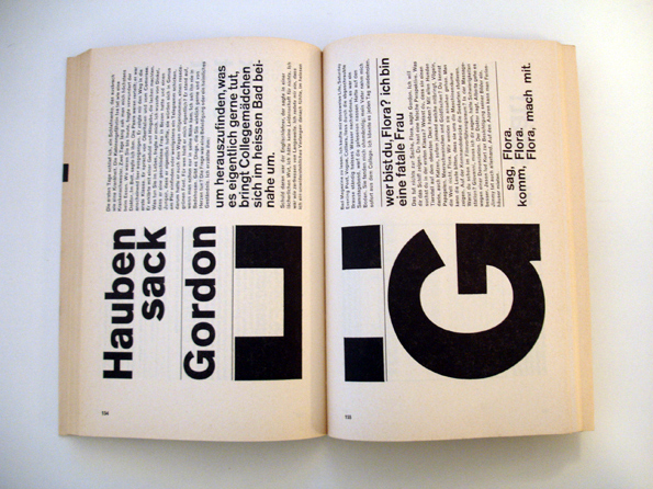
This guy is amazing. Very versatile with his use of media, style and executions. He seems to have a heavy interest in Typography as a basis for his work, but seems to produce things using this interest which don't seem to have much relation. I really really like his typefaces, but this CD cover design is marvelous.


This guy is amazing. Very versatile with his use of media, style and executions. He seems to have a heavy interest in Typography as a basis for his work, but seems to produce things using this interest which don't seem to have much relation. I really really like his typefaces, but this CD cover design is marvelous.
Wednesday, 3 December 2008

Sunday, 30 November 2008
Research: Front design
http://www.frontdesign.se/
It seems underlining is back in and is fully acceptable. I say this because last year we were taught never to underline things when dealing with type by Graham, however recently I see a lot of typography re-using the option to underline. I think its useful and I agree it is a trend. The underline creates a border/ a frame edge illusion and allows you to work with it or against it.
It seems underlining is back in and is fully acceptable. I say this because last year we were taught never to underline things when dealing with type by Graham, however recently I see a lot of typography re-using the option to underline. I think its useful and I agree it is a trend. The underline creates a border/ a frame edge illusion and allows you to work with it or against it.
Research: Patrick Fry

http://www.patrickfry.co.uk/
Amazing website, very similar to the layout I have come up with. The way it displays work and navigation is good, I used a 5 column grid and utilised the first column for navigation where he has used the first 2 for navigation.
Friday, 28 November 2008
Assembled: Pixel Perfect


Its 3:10am on Saturday morning. Yes, thats right. 3:10am Saturday morning.
I've been sorting out Assembled comps since getting home from uni about 5 ish this/ yesterday afternoon.
Why?
Because I had a chin-wag with Joe Gilmore yesterday/ the day before, who was kind enough to give me advice and information about how he designs his websites. He was also kind enough to inform me of a term called "Pixel Perfect" which basically entails calculating the purpose of every pixel within your webspace. So effectively, if you were to slice up an 800x600 pixel website, you would know how much space each element/ asset takes up and thus disallowing any dodgy browsers out there in the world to make your website look 'orrible.
So from the images you can see a sample page and how I have had to use a strict grid (which took me ages to design and calculate) which helped put together each page in a pixel perfect manner.
You see, before I spoke to Joe, I thought I had wrapped up this brief, had all my comps ready in illustrator, had my board pretty much set up for print then assessment.
Little did I know about Pixel perfect.
O, and I have some advice for anyone reading this thats considering designing a website.
1. PLAN.
2. PLAN AGAIN.
3. Once you've planned it again, go over your revised plan and plan it again.
Seriously, I messed up the layout 3 times purely by not calculating my grid guides properly. Remember margins and gutters still exist on websites. And unlike inDesign which makes the job of setting those up quickly and rather automated, doing it in Photoshop takes a lifetime. SO PLAN! THEN PLAN AGAIN! THEN PLAN YOUR PLAN AGAIN!
Nuff ranting, its bedtime.
Interest: Nike run by Wieden and Kennedy
Simple composition, pretty much the same assets repeatedly used yet minimized to give effect of distance and high population.

Wednesday, 26 November 2008
Update
So at the moment I have been working meticulously on my website brief for Assembled. It should be completed by the end of the week to which I should have my presentation board up explaining how the website works etc with it completely designed with measurements. Then its a case of redoing some of my development sheets and printing out some of the options for the assets on the webste.
FES: I have since completed the FES logo, just need to design and finish the board.
Stop Telling: I still need to screen print onto some of the posters, I have 4 days set aside to do this and so am not too concerned about it atm.
Promoting the Website: This will be a one week brief, just to find a means of promoting and finding ways of getting the website out to the desired audience/s.
As you can see from earlier posts, I have pretty much finished the website, just need to do the sitemap and its pretty much ready to be printed off.
Tuesday, 25 November 2008
Research & Personal Reference: here i am
Stumbled on this website for a graphic design agency in manchester called Here I am.
http://www.here-i-am.co.uk
Its got an interested website layout, 1 single frame, just really long scroll down. Works if you are looking as a client and want something quick and professional. Plenty of bright colours, large typefaces, okay-ish layout but then again thats me, a designer talking about design, not a person talking about design. The information is delivered with very little loading time wasted.


Monday, 24 November 2008
Research: Helvetica Vs Arial
I found this which may help with my dissertation.
http://www.mimeartist.com/helvetica/
http://www.mimeartist.com/helvetica/
Research & Inspiration: Roman Jaster
From California and teaching at University, this Roman Jaster guy knows how to manipulate white space, grids and challenge traditional/ fundamental beliefs to do with typography. I like the way he utilises the media and print quality. His layouts are unconventional and challenge the eye yet are aesthetically pleasing to look at. Huge canvases with small, strong and constructed bodies of text. Great stuff!


Research & Inspiration: Round.com.au
Round.com.au
The difficulties caused by flash websites for blog posts is a nightmare. So, yeh, there is a piece under their "work" section for the Kids Culture Trust, a map of melbourne. Aside form it being a beautiful piece of printed info graphics, it displays the road where I use to go to school when I lived in Australia. Infact it is the exact road, "Toorak" school, on "Toorak Road".... aaah, good times.
The difficulties caused by flash websites for blog posts is a nightmare. So, yeh, there is a piece under their "work" section for the Kids Culture Trust, a map of melbourne. Aside form it being a beautiful piece of printed info graphics, it displays the road where I use to go to school when I lived in Australia. Infact it is the exact road, "Toorak" school, on "Toorak Road".... aaah, good times.
Sunday, 23 November 2008
Research & Inspiration: Karl Gerstner
One of the pioneers of Swiss graphics. Bloody marvellous.
I know I'm digging back into the past and should be looking at whats going on know, but you can't ignore a piece of timeless graphic design like this book named "Schiff nach Europa" (Boat to Europe), which Gerstner designed. Living within the grid. So powerful.
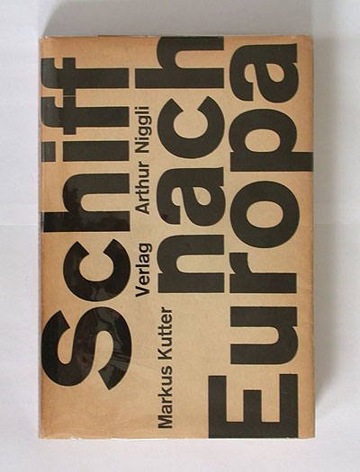
I know I'm digging back into the past and should be looking at whats going on know, but you can't ignore a piece of timeless graphic design like this book named "Schiff nach Europa" (Boat to Europe), which Gerstner designed. Living within the grid. So powerful.
Thursday, 20 November 2008
Assembled: Black Dots
Today I gave out my forms to be filled in to dow ith people's profiles for the website. Seeing as I am only proposing the idea on boards for submission, I essentially only have to display a handful of multi disciplined people on the course.
From that, there will be photographs for the profiles will be as such!...
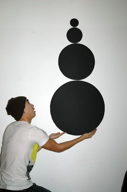
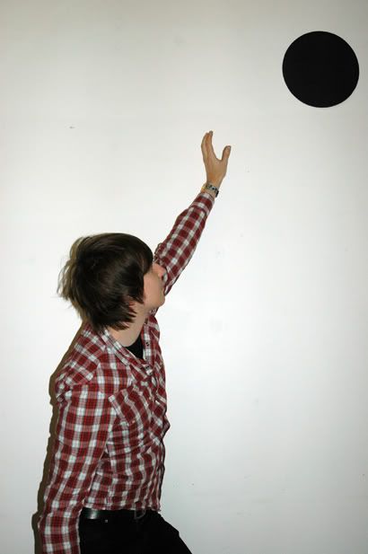
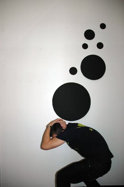
These are of our fellow course mates interacting with some black spots which relate to the course logo of Assembled, which just assembled written on a black dot.
I have about 10 people so far, hopefully netting the rest of them tomorrow, those who do not get a photograph will be given just the blank ones of just the dots arranged randomly.
I'll keep you posted on how it goes.
From that, there will be photographs for the profiles will be as such!...
These are of our fellow course mates interacting with some black spots which relate to the course logo of Assembled, which just assembled written on a black dot.
I have about 10 people so far, hopefully netting the rest of them tomorrow, those who do not get a photograph will be given just the blank ones of just the dots arranged randomly.
I'll keep you posted on how it goes.
Wednesday, 19 November 2008
Assembled: Name
Thats the name of the website for the hub, the reason for this is because connotes collectiveness, readiness and ability to do something spectacular... i think.
Another idea was Leeds College of Art and Design Graphic Design Collective, or LCADGDC... bit long winded.
or LCAD Hub.
or the Hive (resident evil... and we're not poisonous anaphylactic shock causing bees)
i think, assembled is pretty cool, it looks good, memorable and nice to work with.
Another idea was Leeds College of Art and Design Graphic Design Collective, or LCADGDC... bit long winded.
or LCAD Hub.
or the Hive (resident evil... and we're not poisonous anaphylactic shock causing bees)
i think, assembled is pretty cool, it looks good, memorable and nice to work with.
Assembled Research: Central St Martins
My original inspiration for the website came from this website, I stumbled upon it some point last year and thought it would be a good idea if our course had something similar which operated differently. The purpose for their site is showcasing the work from students final exhibitions, or portfolio's. It's laid out in a very simple manner, although not as clean as I would have it but there are no technical gadgets or operating scripts on the site meaning everything loads mega fast, thanks to the almighty broadband!
I like how they allow the students to design their own pages, however some of them are witty and interesting in layout/content, some are just boring and careless.
I like how they allow the students to design their own pages, however some of them are witty and interesting in layout/content, some are just boring and careless.
Assembled website Research: Leeds Met
http://www.lmu.ac.uk/as/cagd/
They have some work showcasing on their website like a blog... not sure on the relevance but the work didn't stick in my mind for the right reasons. Think we're marginally better... but how big is a margin? : )
They have some work showcasing on their website like a blog... not sure on the relevance but the work didn't stick in my mind for the right reasons. Think we're marginally better... but how big is a margin? : )


Monday, 17 November 2008
Assembled: Website Research
Been doing some research into websites, mainly those which show design work whether it be their own agencies or other peoples, like a showcase/ hub. I thought I'd elaborate on some of the research I stumbled across and to note down some key points I noticed which bugged me about some of them, or perhaps some things which make these sort of websites unattractive.
Where is the menu bar?: I want to know where the menu bar is immediately, literally within half a second of looking on the screen. I don't want to have to run my cursor over a blob to reveal a menu in 6 pt script type. Make the task of the audience easy!
Pixelled images: This regards to a lot of the flash sites that I saw, and some of the CSS/ HTML built ones. It really puts the viewer off when images are all scruffy and painful to look at. If you're going to make them pixelated, make them REALLY pixellated so it looks like its done on purpose... if you've done it on purpose.
Poor Navigation: As I said before, its realy annoying not being able to locate the navigation bar enough as it is, so when I get there is it really any better than its difficult to use? Mouse over areas which are about 2 pixels squared over a large word so you have to literally find that tiny hot spot. Why???
Colours: Why use such horrible colours? And even more so, why use so many of them in one space? It's as if colours have just been invented and you've gone trigger happy with them. Don't. Be clever and considerate with them, my eyes are sensitive. The best sites stuck to either black on white or white on black, its traditional and boring yes, but you don't buy books with red on green pages do you?
Too much on one page: The beauty of a website is that it is on-screen based, you can essentially spread information out on a screen. So please, don't put everything on one page, graphic design websites that do this look really unprofessional and undisciplined. Unless the information you're displaying is really relevant such as the BBC, or YCN for example, there is no need to do so.
Negative Space: Is powerful, every Graphic Designer should know the power of negative space. Its relevant in print, so why not use it in such beautiful ways on-screen?
Flashing image: Are you trying to make me noxious? Get my attention if its relevant, don't just have flashing nu-rave jargon on your site because its "cool" or "contemporary".
What are you?: State, what your company or what this website is about on the first page so people know vaguely if not exactly what you're about. "Graphic Design Agency", "Creative network" or "Top Class Angling Tips".
Body text larger than Headings/ Menu titles: Sounds stupid doesn't it?
Animated text: Why would you use text like this, its like making me read at a pace you've decided on. Unless its for a purpose, don't do it. Its a poor and annoying aesthetic quality. Everybody hates a slow driver.
Gradient backgrounds: This is just a personal dislike of mine, I think it can be very nice, but when used on some of the websites that I found, it really bugged me. Gradients show weight, light to dark, separating sections on gradients is difficult, especially when dealing with text and can easily be done badly.
Look like what you're suppose to be Some of the agencies/ websites looked like they could've been mistaken for medical, dentistry or even estate agents. It makes no sense. Apparently Adrian Shaughnessy explained that the reason for some Graphic Designers looking so horrible is because they're designing for their clients, who rather not see the aesthetic nonsense of Graphic Design websites. Perhaps that is true to some extent but surely there is a healthy medium between the two worlds? Its not like designers read a different language to clients.
So here are some of the culprits I found (There are a lot more, I could go on forever)...
Discript.com
9thplanetdesign.co.uk
Edition.co.uk
Firedog-design.co.uk
Nha.co.uk
Liquid.co.uk
Typetechnique.co.uk
Sherrydesign.co.uk
(Sorry....)
Oh, and these are some pretty good websites I found.
theChurchOfLondon.com
nbstudio.co.uk
studiojuice.com
400.co.uk
Deletelondon
bostockandpollitt.com
iamhuman.co.uk/
Friday, 14 November 2008
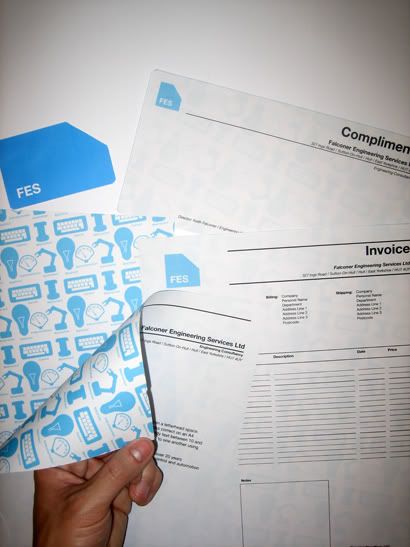
FES Logo: Evaluation
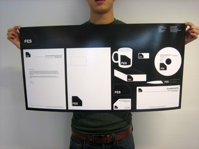
For this brief I was approached by my girlfriend’s father asking me whether I was interested in coming up with a logo, for his newly established company. The company is a specialist Engineering Consultancy, an industry in which he has been working within for around 20 years and has a lot of experience. His job is to organize and seek out resources, methods and solutions for mechanical, electrical, instrumentation, control and automation engineering.
He asked me to design something quite different to what his competitors had done, which through research gave me an idea of what I was up against. From what Keith proposed as an idea for me, I decided to try and produce a more designer led approach using vibrant colour, different grid layouts, using simplicity as my inspiration.
I gave myself restrictions on colours and typefaces this is something that I had to do as I know I work better with boundaries and restrictions. The body of work that was asked by me was a logo, letterhead, business card and compliments slip. I went further and designed allsorts of other bits of stationary in which the logo could work alongside with. I think I got out as much as I could with the body of work, realistically within the timeframe that I set myself.
It did take a bit longer to complete the brief than I had previously set myself, this was due to the client response/ feedback time and wanting to alter and add things to the design, such as the back print of the stationary which were originally suppose to be 5 little icons underneath the logo to which I expressed my concern on effectiveness when the size of the logo was reduced. All in all it took approximately 1 and a half if not 2 weeks in total (I set myself 1 week to complete this project).
To document the work I took photographs, maintained this blogspace and recorded my development on design sheets, will be useful if I wish to show my working process in my portfolio. I enjoyed working on this brief and am proud of the work I produced.
Thursday, 13 November 2008
Research & Inspiration: Teeside TV Ad
Saw this on TV, thought it was quite a good advert, great execution and very simple.
Research & Personal Ref: Interesting Website Layout
www.deep.co.uk
Stumbled on Deep.co.uk, a graphic design agency in London. They've got a wonderful website navigation system for you to look at their work. It's like an auto scroll, strange yet nice layout.
Stumbled on Deep.co.uk, a graphic design agency in London. They've got a wonderful website navigation system for you to look at their work. It's like an auto scroll, strange yet nice layout.
Tuesday, 11 November 2008
Research & Personal Ref: ODD Design Agency
www.thankodd.com
Really interesting Graphic executions, packaging or 3D.
Really interesting Graphic executions, packaging or 3D.
Monday, 10 November 2008
FES Logo: Revisited
Right, so following a further discussion with Falconer Engineering Services I have now extended the project by client request.
I have to design an additional 5 icons representing the services of the company, Mechanical, Electrical, Instrumental, Control and Automation. It is so that the type of clients that may be interested in FES will know what type of Engineering services are available as there are many different specialisms within the industry (like most other industries!).
So anyway, I went away and came up with 5 icons which were suggested,
Mechanical - Nut and bolt
Electrical - Lightbulb
Instrumental - Pressure Gauge
Control - Keyboard
Automation - Robotic Arm
All of which were deemed "perfect", however I struggled to think of a way in which to get it across without altering my original designs/ layouts for the stationary and logo etc. Therefore, I rehashed an old idea I had for the Don't Panic poster I did earlier this term and created a repeating pattern which sits across the back of the stationary sheets. It gives the paper more value and the client really likes it so I guess its a winner.
Friday, 7 November 2008
Stop Telling Me What To (Almost) Do!!!
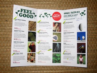
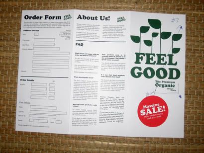
Right so, for this brief I've been working on a solution to counter this oppression of Organic-ness. Which through my research, I feel is more like a fashionable brand, or another name for "better quality" products. Therefore I have produced a catalog, promoting so-called PREMIUM Organic living. To enhance the level of Organic-ness to the next level.
Within this catalog, one can buy bedding made of real Hay/ Straw, wash ones face with water extracted from roadside puddles or even subsidies toilet paper for a bag of fallen leaves. It's all in the name of fun which is what I wanted to do for this brief, "have fun" which I think I have achieved. I've had a chance t play with layout on a different format to what I'm use to (DL leaflet), and had to design using a style which I am not familiar with (recycled, sustainable or organic). Also, my worst enemy of coming up with content has been overcome for this one, I have generated the copy and ideas through research and imagination which I feel has been an uphill struggle and time consuming for me in the past. But not anymore!
So what I'm showing you below is not 100% completed yet as I am still not happy with the layout, there are some fine tweaks to adjust and with the help from pulling in crits with people in the day to tell me what is working and what isn't. The general concensus is that it's fine, it just needs to be printed onto recycled stock which I have accumulated.
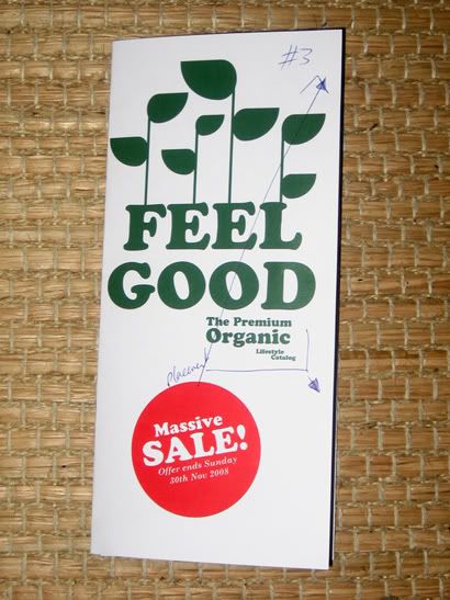
Thats all folks!
Within this catalog, one can buy bedding made of real Hay/ Straw, wash ones face with water extracted from roadside puddles or even subsidies toilet paper for a bag of fallen leaves. It's all in the name of fun which is what I wanted to do for this brief, "have fun" which I think I have achieved. I've had a chance t play with layout on a different format to what I'm use to (DL leaflet), and had to design using a style which I am not familiar with (recycled, sustainable or organic). Also, my worst enemy of coming up with content has been overcome for this one, I have generated the copy and ideas through research and imagination which I feel has been an uphill struggle and time consuming for me in the past. But not anymore!
So what I'm showing you below is not 100% completed yet as I am still not happy with the layout, there are some fine tweaks to adjust and with the help from pulling in crits with people in the day to tell me what is working and what isn't. The general concensus is that it's fine, it just needs to be printed onto recycled stock which I have accumulated.
Thats all folks!
Wednesday, 5 November 2008
Personal Ref: Delete
Just found a graphic design agency called Delete in London.
Specializing in on-screen and digital work, although they do have some print.
http://www.deletelondon.com/work
Specializing in on-screen and digital work, although they do have some print.
http://www.deletelondon.com/work
Monday, 3 November 2008
Falcomplished!
My blog headings may start turning into "The Sun" style headings from now on!
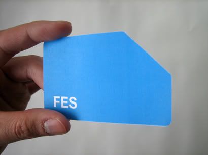
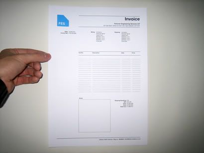
Anyway, here's the F.E.S logo completed, on some examples on stationary.
Business Card.
Invoice Letter.
Stationary example collection sheet.
Anyway, here's the F.E.S logo completed, on some examples on stationary.
Business Card.
Invoice Letter.
Stationary example collection sheet.
Dissertation
Reading, writing, re-reading & writing some more.
A little trick, if you write out your Harvard Ref. bibliography first, you can use that as your quoting index which will also save you time at the end when you have to do it.
A little trick, if you write out your Harvard Ref. bibliography first, you can use that as your quoting index which will also save you time at the end when you have to do it.
Tuesday, 28 October 2008
Stop Telling Me research: Why Buy Organic?
http://www.healthfreedomusa.org/index.php?page_id=323
This website is hilarious, it quotes on how great Organic food is without any scientific reasoning, just idealism; because foods without pesticides are less dangerous than with, nicknaming them "frankenfoods".
Organic hs only been introduced within the last decade, foods on our shelves have been enhanced through science for many years, I don't know any people who've eaten enhanced carrots to have tumors or other diseases. This Organic thing seems to be genius, it plays on the logical reasoning of the human mind without backing any of it up with the science, which science has proven that organic is no different to standard.

Subscribe to:
Posts (Atom)