In retrospect of this module I feel I have produced some interesting work, displaying my capabilities as a designer in the present and for the future. Juggling four briefs is something that I am use to now and believe it is good practice to organise time, dedicate and sacrifice to complete them in such a manner.
Originally, I set out to put in place 4 briefs with resolutions that would compliment my portfolio and developing work, which represented me when approaching the industry. These were type driven, layout for onscreen and print purposes, to promote and inform causes which were of interest to me, whether it be corporate industries or for a cause that I felt strong about. I feel I have successfully adhered to my aims, by completing a corporate identity (F.E.S.), an interesting solution to a cause I had an opinion on (Anti-organic), Type and Layout on-screen in the form of a website (Assembled) and type and layout in the form of print.
I realise now that my style of design certainly is not intended for graphic designers nor does it try to communicate strongly to others within the industry, but more towards in aid of society and the public, non-designers. In reference to my rational, I set out to be a “useful” designer. This perhaps, is because I’ve always believed that design should have a message and should tell that message in a way that is interesting/ witty or simple to understand. And I think there is more purpose in the world for this type of Graphic Design, to be able to communicate information to those who really need clarity of information.
The weaknesses I would identify from this module would most probably be the posters from the Anti Organic brief as the screen print quality did not come out as well as I would have hoped, as some fine details were lost due to a lack of pressure when running the spot varnish over the screens. In light of that I did enjoy it as it re-ignited my interest for this particular print process and the quality it gives to the work produced. I particularly enjoyed mixing the printing techniques of digital and screen, and can perhaps think of more interesting ways to utilise that in the future.
I also struggled with some of the design for web, as I have never done so previously before with little guidance. I was introduced to the term ‘Pixel Perfect’ by Joe Gilmore, which then complicated the project and made me realise how difficult and precise it was to ready comps for internet production. This project made me wonder whether I needed to become fully competent with Dreamweaver or web-design as it seems unnecessary if my job/ aim is to design layouts and styles for websites, however saying that, I think it would be useful to understand the process of actually producing a functioning website in the future, perhaps in my own time.
My strengths on this course have been down to my notepad/book, which I owe greatly to for keeping me organised and reminding myself to stay on top of things. Without it I don’t think I would have met the deadlines or produced the work that I did. The highlight piece of work has been designing the website, where I got to produce layouts on screen and learnt to think about different constrictions when doing so, as well as being a creative thinker (the dots) a photographer for some of it.
Overall this module has been a valuable lesson for me. I have come closer to recognizing where I fit into within the industry, I have explored designing websites (which I have a keen interest in) and realised that screen-printing is something I should perhaps utilise in the future. This has been useful, as I also have more work to put into my portfolio and can move forward onto the next stage of this course, where I hope to go on and challenge my abilities and explore different areas of Graphic Design.
Thursday, 18 December 2008
Sunday, 14 December 2008
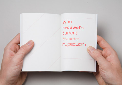
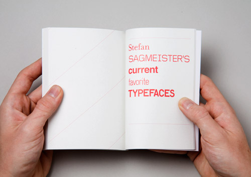
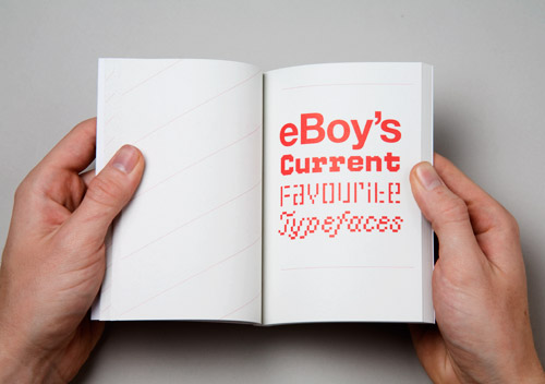
Research & inspiration: 50 Designers Current top 5 Typefaces
This book would be good to get a hand on.


Tuesday, 9 December 2008
Promoting Assembled: Development/ Trials & a quick update

So for this brief I am promoting Assembled in a manner which realistically wouldn't be done if in a way in which if I were to seriously do it. I really want some typographic work, some interesting, visually attractive stuff in my portfolio and so I have embarked on a quest to design some posters promoting Assembled via A1 dimensions.
Up until now, I have worked on a corporate identity, an interesting conceptual solution for a cause and opinion I set myself, and designed a website which have been all fun and interesting. However I don't feel as though I've had time in the playground to try something on my own, to express some inner feelings... if that doesn't sound too pathetic... so I guess this brief is my chance to be myself more than I would normally be. I love type. I love dealing with type on an empty space. Arranging it, playing with it, give it breathing space, squash it, order it... I like to boss text about. So today I spent the day doing this.
Above, you can see I printed off a good 27 trials, fromt hose I have about 3 I want to display for the final crit tomorrow. I took text from the course module handout, which took ages to type up and I wish I had a digital version I could have copy and pasted from... although god hasn't made himself known, he sure has a funny way of helping us out when we're stressed and not in the mood for typing all day.
But yeah, I guess the reason I did it was because I haven't had the chance to deal with a large amount of text before, well.. I have but not in a way which I got to call the shots. Plus I did find this awesome website:
www.typographicposters.com
... Which helped fuel the fire to do something creative with my cause.
Here are some of the strong ones I really like, mind you they're printed on A3, through black and white laser printers upstairs. So... not the best quality but it gives me a feel of what the layout is like printed on a page. I think I may need to ass some color, gonna bring that up in the crit.


Monday, 8 December 2008
Inspiration: G2 Supplement


I brought the Guardian with the G2 supplement today and on the cover of the G2 supplement was this really amazing title design of a Christmas Tree that reads, "Thrifty Christmas". Its done using card and really good lighting to bring out the color of the paper stock, using curling and I imagine some glue to stick it down on the canvas. Really inspirational.
Also came with todays issue was this Wrapping paper design by Yoko Ono (Lennons Widow), to which I was shocked and horrored at. I am an avid follower of modernist style type design, however this was rather uninventive to the eye. maybe I'm not getting "the point" but it just doesn't seem christmassy, it doesn't say anything other than "imagine" and "peace" and other words in other languages... I'm guessing related to a similar topic and theme. I don't know... what a contrast between 2 pieces of design from the same newspaper on the same day.
Sunday, 7 December 2008
Dissertation Research: Can you tell the difference between Helvetica and Arial?
http://www.iliveonyourvisits.com/helvetica/#
I scored 4 out of 10.
shame on me.
I scored 4 out of 10.
shame on me.
Stop Telling Me: Update


So I spent the day on friday finishing my screen-prints of some mock-posters for the Stop Telling Me brief. I spot varnished some text on-top of the posters. I guess the idea behind the posters were to really get ppl to try and read what the message was about. So ideally, someone would see a nice black poster with some leaves and such and then get closer only to be told something about organic products and some information about the blog. Keeping it simple as I always do, neat and tidy, clean and clear. Although one of the prints came out badly (I printed 6 in total, 2 of each poster).
They even struck up a conversation with Neil down at Screen-print where he told me how he felt about organic products and completely agreed with my cause against organic being so costly for people. Overall, I'm happy with the result even though I did not intend to do screen printing for this module, I'm glad I've finally had the chance to try it out and appreciate the process again which I may use again later on in life/ on the course.
Friday, 5 December 2008
Simon Bent
http://www.volume2a.com/
This guy is amazing. Very versatile with his use of media, style and executions. He seems to have a heavy interest in Typography as a basis for his work, but seems to produce things using this interest which don't seem to have much relation. I really really like his typefaces, but this CD cover design is marvelous.


This guy is amazing. Very versatile with his use of media, style and executions. He seems to have a heavy interest in Typography as a basis for his work, but seems to produce things using this interest which don't seem to have much relation. I really really like his typefaces, but this CD cover design is marvelous.
Wednesday, 3 December 2008

Sunday, 30 November 2008
Research: Front design
http://www.frontdesign.se/
It seems underlining is back in and is fully acceptable. I say this because last year we were taught never to underline things when dealing with type by Graham, however recently I see a lot of typography re-using the option to underline. I think its useful and I agree it is a trend. The underline creates a border/ a frame edge illusion and allows you to work with it or against it.
It seems underlining is back in and is fully acceptable. I say this because last year we were taught never to underline things when dealing with type by Graham, however recently I see a lot of typography re-using the option to underline. I think its useful and I agree it is a trend. The underline creates a border/ a frame edge illusion and allows you to work with it or against it.
Research: Patrick Fry

http://www.patrickfry.co.uk/
Amazing website, very similar to the layout I have come up with. The way it displays work and navigation is good, I used a 5 column grid and utilised the first column for navigation where he has used the first 2 for navigation.
Subscribe to:
Posts (Atom)