http://www.healthfreedomusa.org/index.php?page_id=323
This website is hilarious, it quotes on how great Organic food is without any scientific reasoning, just idealism; because foods without pesticides are less dangerous than with, nicknaming them "frankenfoods".
Organic hs only been introduced within the last decade, foods on our shelves have been enhanced through science for many years, I don't know any people who've eaten enhanced carrots to have tumors or other diseases. This Organic thing seems to be genius, it plays on the logical reasoning of the human mind without backing any of it up with the science, which science has proven that organic is no different to standard.
Tuesday, 28 October 2008

Monday, 27 October 2008
Underlines

I got the idea for underlining the stationary for FES from Bibliotheque. Its really interesting how simple lines and grids can be used in such an imaginative way.
Thursday, 23 October 2008
Bruno Maag, Liverpool Design Symposium
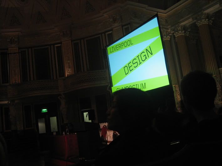
Right so, went to see Bruno Maag a Typographer originally from Switzerland who was doing a lecture in Liverpool. 'We' being Jimmy, Claire, Nicky, Daisy, Matty, Bel and I travelled across the shoulders of Britain, which was good fun. We set off at 11 am ish and got there about 1 which is pretty good I suppose. The weather was weird, it looked like it was going to let loose on us but never did.
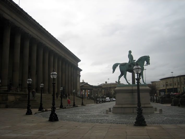
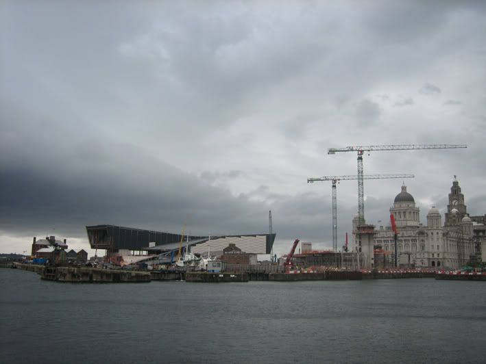
Here are some photo's I took;
Outside the square where the lecture was being held.
The Albert Dock.
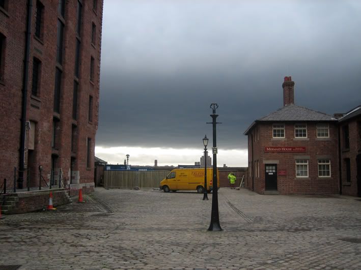
The Tate in Liverpool, well... round the corner from it.
All in all, it was a wicked day out. The city was completely different from what I had imagined it would be, I heard lots of negative things about it but I realise now it was a complete misconception. I'm even thinking of looking for a job there perhaps at some point in my career!
Also, here is a video I uploaded onto Youtube of the lecture, it's only the first few minutes but still pretty cool. I took a another video but it takes ages to upload anything on Youtube, I just lost patience.
Thats all for now.
Monday, 20 October 2008
British Chamber of Commerce logo
Saw the logo for the British Chambers of Commerce logo on the news and thought how movable and applicable the design is.

http://www.britishchambers.org.uk
Go visit the website to see what I mean. It's so good, I can't get over it. It works in black, and the idea of growth, commercial and corporate-ness is conveyed so well. Going to see what aspects I can take from it for doing logo designs in the future.
http://www.britishchambers.org.uk
Go visit the website to see what I mean. It's so good, I can't get over it. It works in black, and the idea of growth, commercial and corporate-ness is conveyed so well. Going to see what aspects I can take from it for doing logo designs in the future.
Thursday, 16 October 2008
Did you know?
That there is no scientific proof that organic foods are better in terms of nutritional value nor do they taste better than their lower tier costing foods?
So why pay more?
Today was a research day.
So why pay more?
Today was a research day.
Tuesday, 14 October 2008

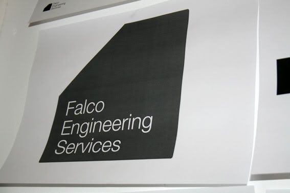
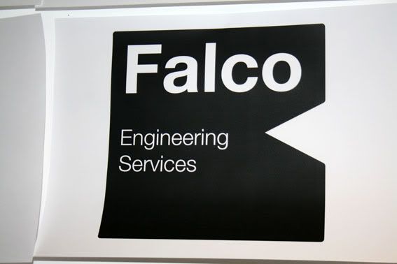
Falco Logo Design: Day 1.
Yesterday I spent some of my day working on Cat's Dad's logo. I imagined as a structural engineering company that it would preferably be a solid shape, or consisting of solid shapes. Conveying a sense of building, reliability and experience; ultimately a company that is dependable and knows what it's doing.
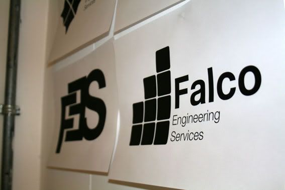
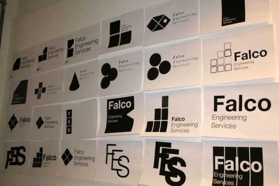
This is what I came up with, and through a process of elimination, I have selected 2 of them to carry forward and investigate.
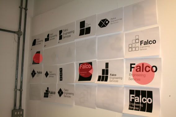
The red dots are ones I have decided to carry forward.
The ideas!
Gonna take a day off working on this one today and get a head start on another of my 4 briefs, which is the "Stop telling me what to do!" brief.
FES Competitor
http://www.kgal.co.uk/

I was told to research a competitor to FES and Kenneth Grubbs was one that stood out. As you can see the name and logo needs work. I think.
I was told to research a competitor to FES and Kenneth Grubbs was one that stood out. As you can see the name and logo needs work. I think.
Monday, 13 October 2008
New Briefs: Here's to decision making!
As part of this Design Practice 3 module, we have been asked to write/ decide on 4 briefs to work on. I have attached the 3 Briefs to this blogpost here as word documents...
Design a Logo for F.E.S
This first brief is straight forward and easy, it is a logo for my girlfriends father who asked me to come up with a logo of or his new company.
Design a Website for a Graphic Design collective/ Hubb
This next brief if something I have been looking to do for a while which is to design a website. I have experienced layout problems and I enjoy tackling them as I find a strange satisfaction in doing so. For this brief, I will be designing a website for some of my fellow students to showcase their work with contact details for any design talent scouts to view and get in contact with.
Design a solution to stop companies urging us to recycle constantly
This is just a bit of fun for me to play around with before I enter the world of serious and possibly boring design post-graduation. this is going to be a big challenge for me as it is the broadest brief that I have and it relies on me making decisions and sticking to them which I have had issues with in the past which I am overcoming.
Surprisingly, coming up with these briefs was quite painless and fun to do which in the past I admit, has been a nightmare because its essentially a decision making exercise.
Here's to decision making...
Sunday, 5 October 2008
Don't Panic!
Right, so for the past week we were given a brief to respond to the Don't Panic pack's which are distributed and aimed at pretentious and over opinionated students across and within the isles of England. If you've ever opened up one of these packs you will find a nice A2 poster which is selected to print via their website entries, along with loads of promotional leaflets for nights out that you'll never go to within your city. Yey!
On the plus side, it comes in a recycled brown paper envelope which you can place everything back into and throw away, which you may well have just done in the first place. Although, I don't disagree with the principles of Don't Panic, I am very pro what they do, I'm just not keen on the kind of people that like to associate themselves with what they do. It's not their fault, its everyone elses...
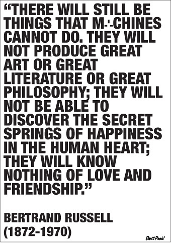
Right, now that I've set the mood perfectly! hahaha, here's what I've been working on for their Poster Entry, under the theme of "Machines".
On the plus side, it comes in a recycled brown paper envelope which you can place everything back into and throw away, which you may well have just done in the first place. Although, I don't disagree with the principles of Don't Panic, I am very pro what they do, I'm just not keen on the kind of people that like to associate themselves with what they do. It's not their fault, its everyone elses...
Right, now that I've set the mood perfectly! hahaha, here's what I've been working on for their Poster Entry, under the theme of "Machines".
This is the quote I used by Bertrand Russell as a means to inspire this brief. 
I then went on to simplify what machines represented in today's society. Attempting to keeping things as simple visually as possible.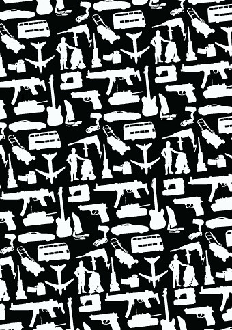
Also, spent a day and a half vectoring patterns to produce a more aesthetic approach to the brief. Thinking more along the lines on what would look good on a wall.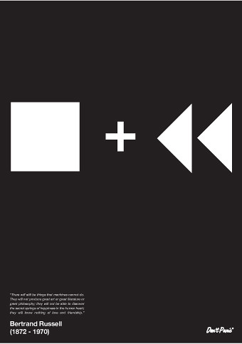
I then came back to my initial idea of Bertrand Russells quote and still wanted to maintain the simplicity of my second idea strand. So I came up with Stop and Rewind.
From the crit feedback, i got mixed responses, as some people felt that it wasn't a suitable message for Don't Panic, that it was too serious. Or perhaps they didn't understand the quote, which I have to say is hardly a rubix cube or a game of level hard sudoku.
I'm going to work on this some more before I post my entry on their website. Unfortunately, everything is about aesthetics.
Subscribe to:
Comments (Atom)